Shaded elephant

Elephant

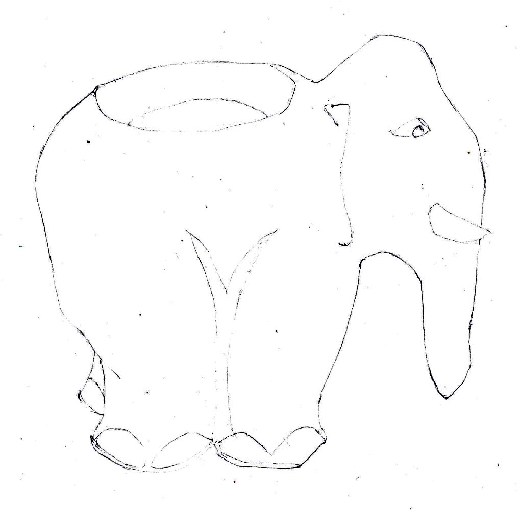
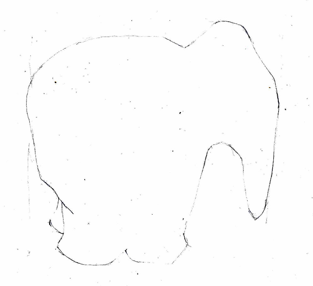
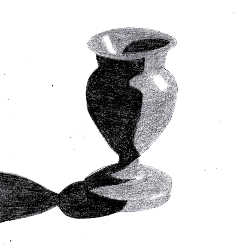
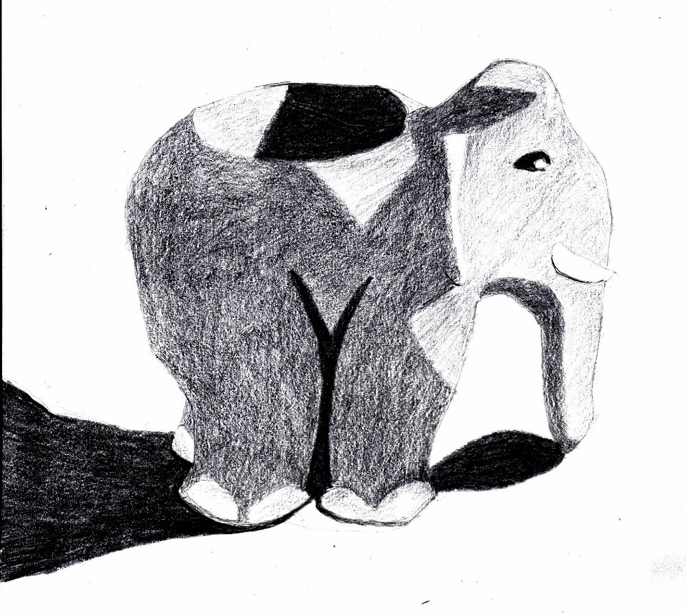
Not a great success, for some reason. The elephant is stained a darker colour here and there and this threw me. It’s hard to distinguish the stain from shadows. This is a fundamental problem – to distinguish between dark colours on the object and shadows. Does it matter? Yes, because the dark colour will get light and darker as it leaves and enters shadows. You need to be aware of that. Need to look at the elephant again tomorrow to see what went wrong.

Shading the vase

First the shadows with an 8B:

Vase

Then the second tone, the mid-tone (2B):

Vase shaded

The second tone seemed too light so I went over it with a 4B:

Vase shaded further

So the 8B was perhaps too dark. The separation between the tones is too much and you miss details in the shadows, evn just the direction of pencil stroke. It’s probabky best to stick with a 6B for the darkest tone, unless more tones are introduced.

Also the shadow was hard to see against the dark wood, so it’s not quite right. Need a better way to identify the edges of shadows.

Tone swatches

I found some new pencils with different blacknesses so I experimented with tone swatches. I’m aiming to have at least three tones plus white. Four tones seem possible but it’s tricky to keep a clean separation in tone because each pencil can look like a darker shade if you press hard enough. It will need control to apply the swatches. I’ll keep the swatches by me so I know when the tone is right for each tone level. I need a reference card.

Tone swatches

Small carving of a vase

The first sketch, which didn’t go well:

Vase

The vase is titlted in relation to its base – why? Because I drew the main axis at an angle.Or the base is at the wrong angle. I only noticed when I scanned the drawing. I need an aid to check as I go along, like a transparent grid. It’s particularly important to use this aid early on, when I’m drawing the axes.