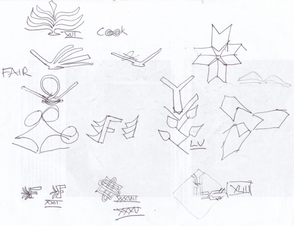
This was on tracing paper, and from my book of historic patterns. Again, I liked the concept of ‘interlocking’, and especially the ancient Persian pattern of interlocking ‘F’s.
A record of my 'picture a day' challenge
This was on tracing paper, and from my book of historic patterns. Again, I liked the concept of ‘interlocking’, and especially the ancient Persian pattern of interlocking ‘F’s.
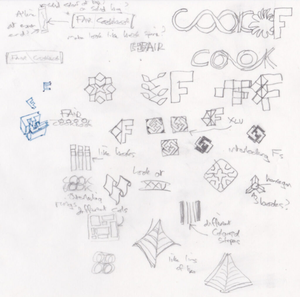
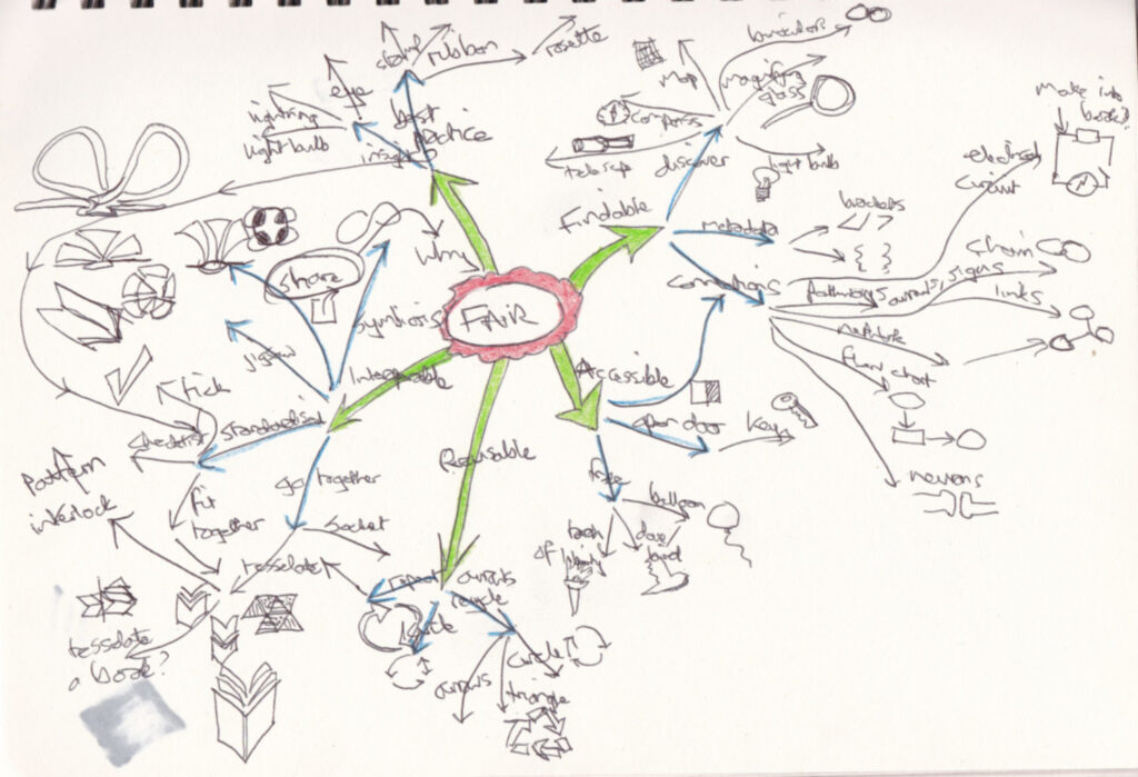
More doodles based on traditional patterns in different cultures, to express the concept of FAIR. I did the second piece of paper whilst in an online meeting and it’s there I stumbled on the idea of making the four ‘o’s work together.
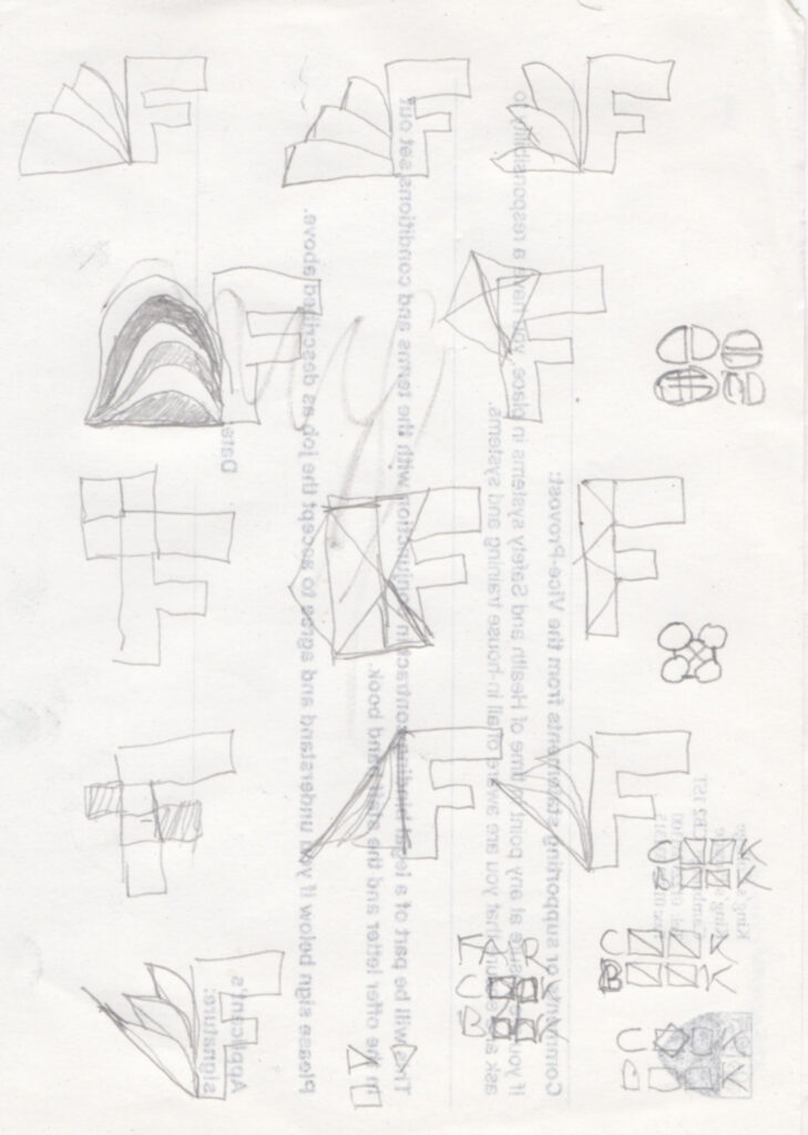
I looked through my books on historic patterns for ideas. The concept of ‘FAIR’ involves things working together, tesselating, so I got interested in that.
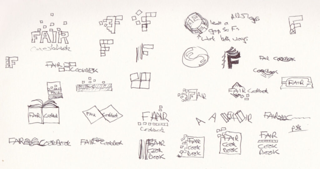
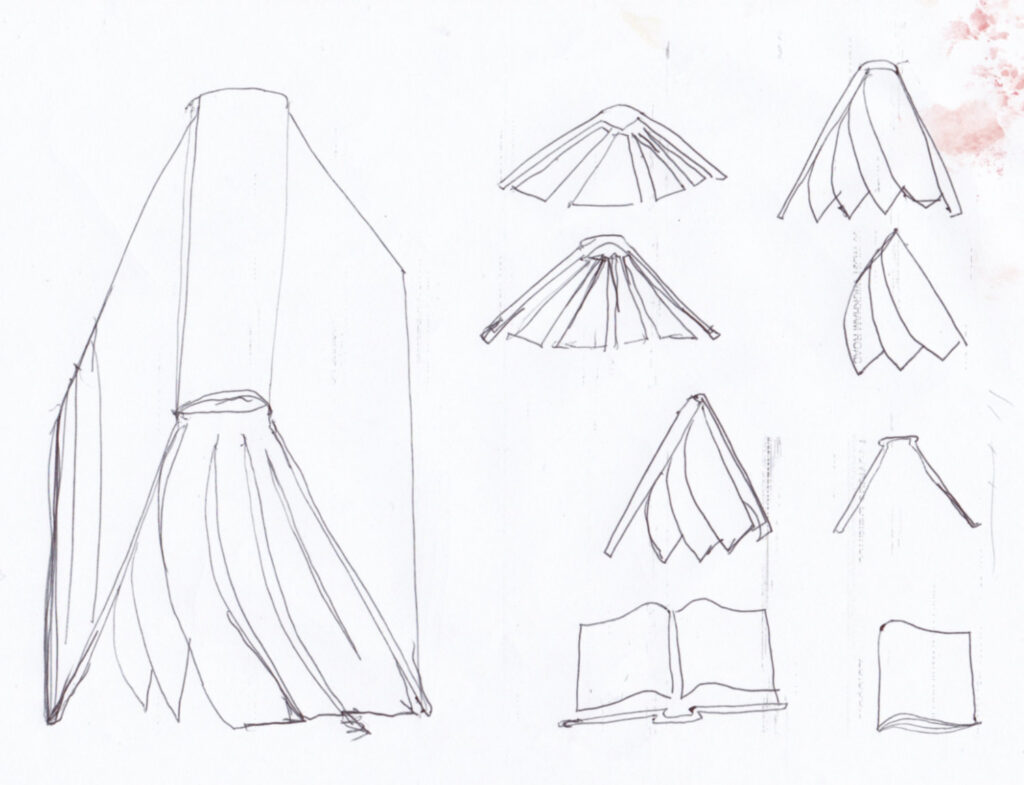
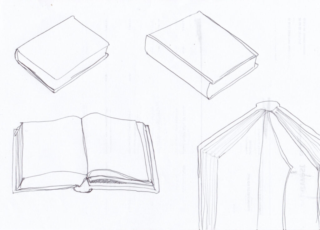
I wanted to get an idea of what a book looked like for the ‘cookbook’ logo.
This time I looked at the conept of ‘cookbook’ and researched imagery around that.
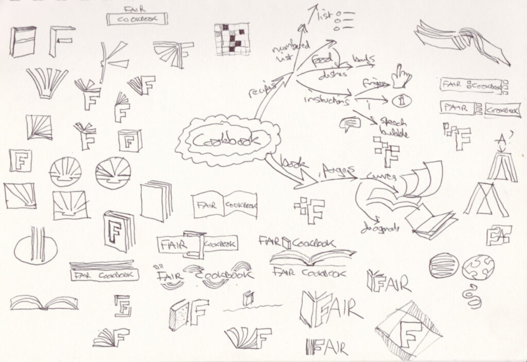
I set out to make a new logo for a website about making data FAIR (Findable, Accessible, Interoperable and Reusable). The website came out aof a project called FAIRplus, and I tried to keep the original colours and font of that project logo for this ‘FAIR Cookbook’. I had a brainstorm and researched the imagery around FAIR.
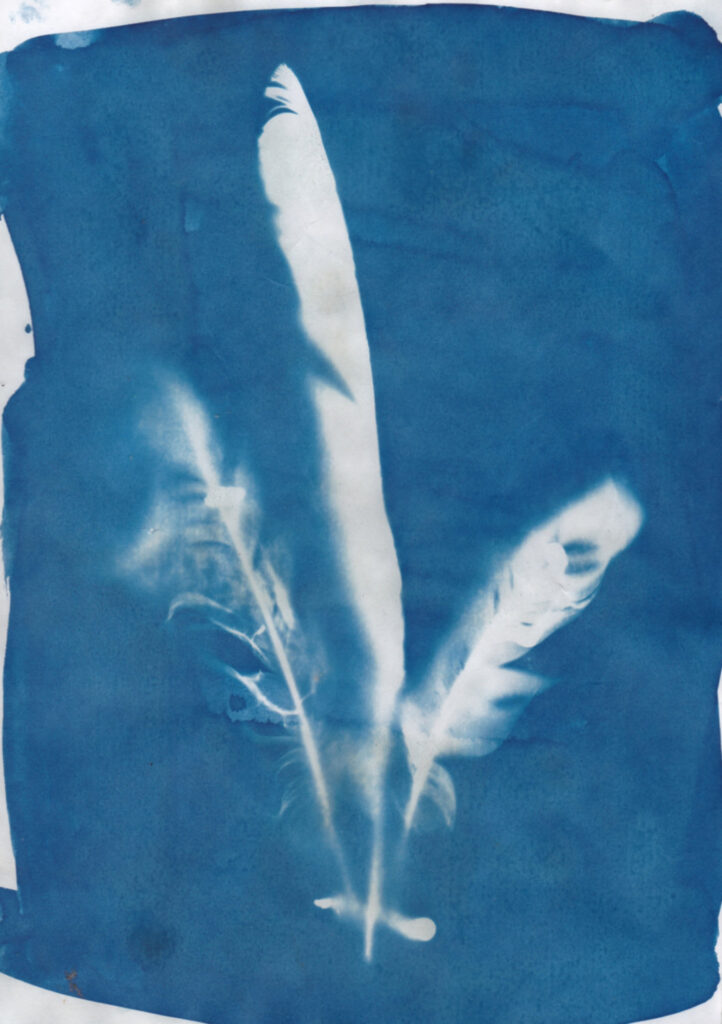
This time I laid the subjects flat on the page and stuck them down with blu-tack. The breeze was a pain! A more successful effort, though.
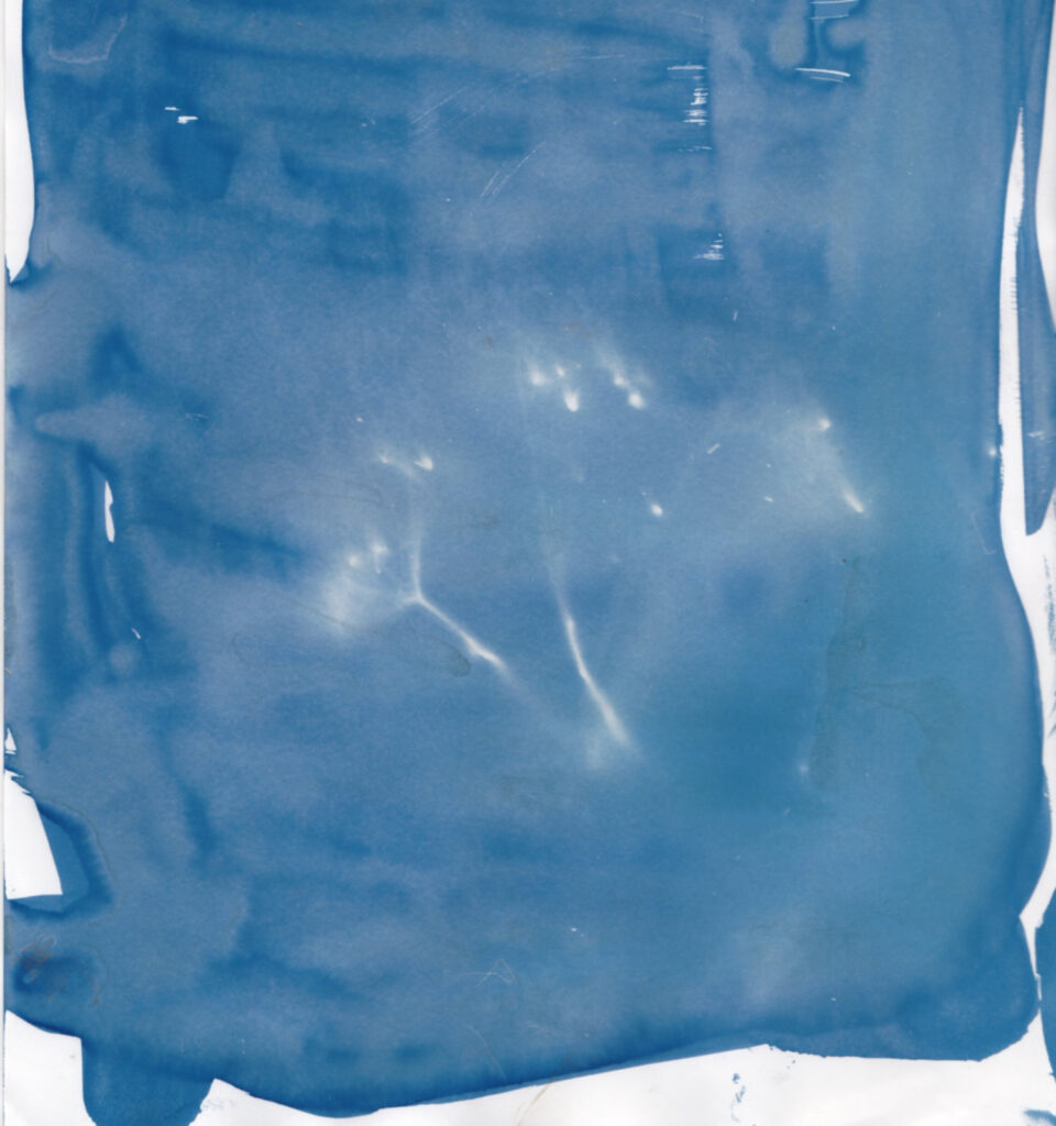
I got a cyanotype kit and tried it on a sunny evening. I think the sun was too low so I had to expose for a long time and I didn’t realise the subject had to be flat against the paper. I thought a silhouette would create an image. This was a seed head and most of it wasn’t touching the paper, so didn’t create an image.
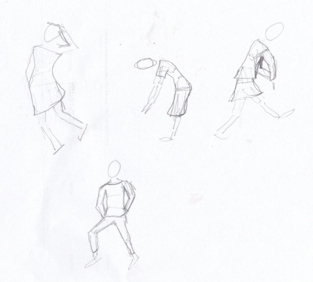
I’ve decided I need to use the drawing methos as a starting point and do more from observation of real people so I can see how the body actually moves, and the natural positions of the limbs. The model is still a helpful start, though.