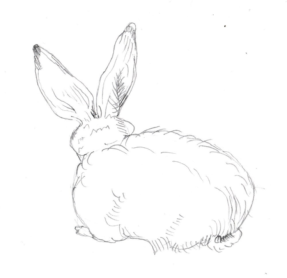
I’ve emphasised the outline here more than Durer because I was worried it wouldn’t show in the scan. In fact it’s too heavy and takes away from the texture a bit. It’s the hairs sticking out that should predominate.
A record of my 'picture a day' challenge
I’ve emphasised the outline here more than Durer because I was worried it wouldn’t show in the scan. In fact it’s too heavy and takes away from the texture a bit. It’s the hairs sticking out that should predominate.
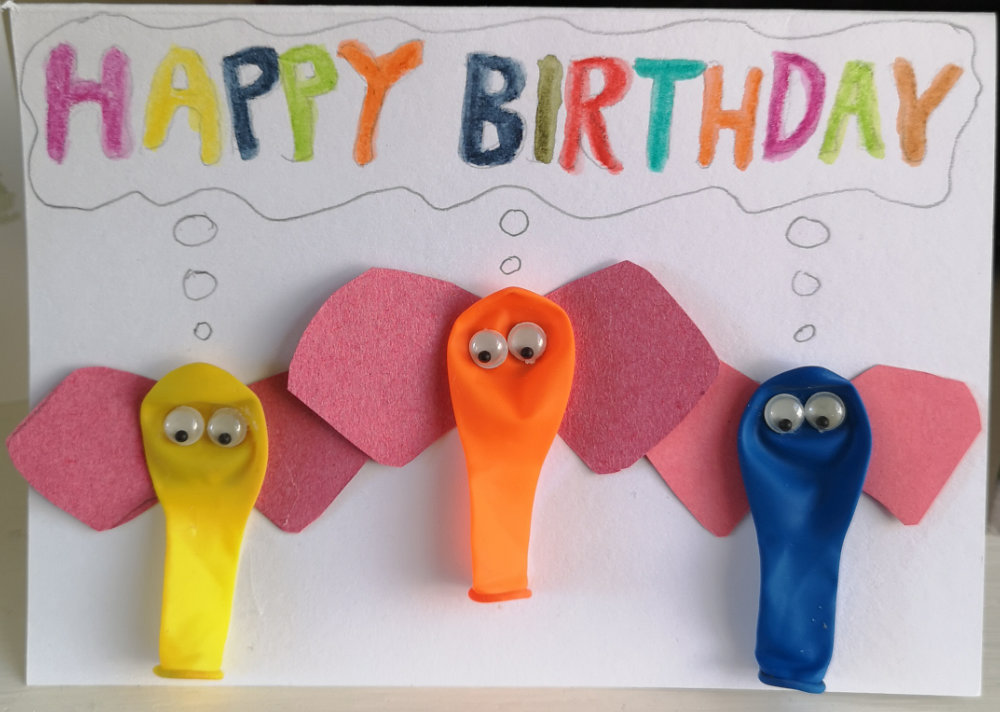
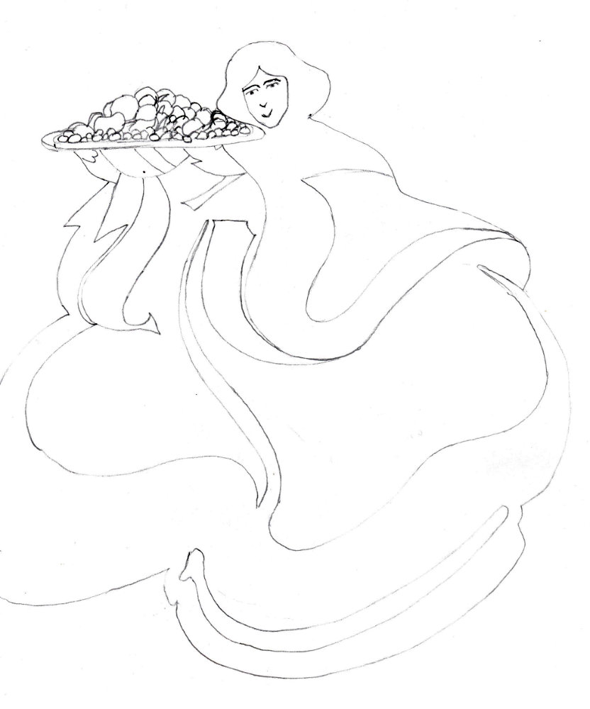
A birthday card for my daughter. I got the idea online.
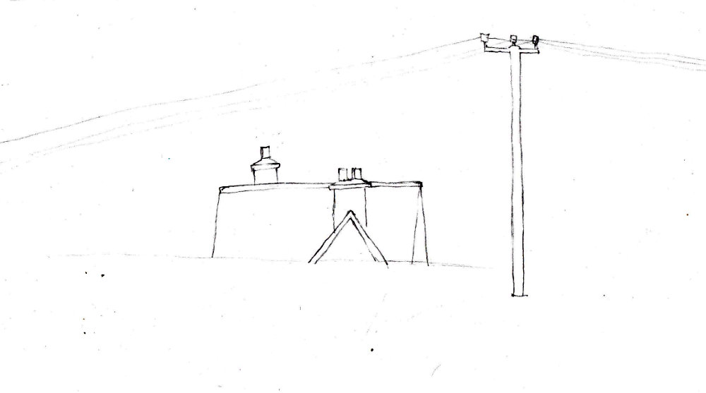
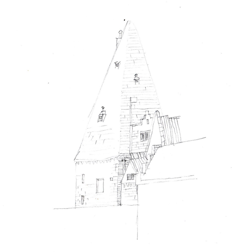
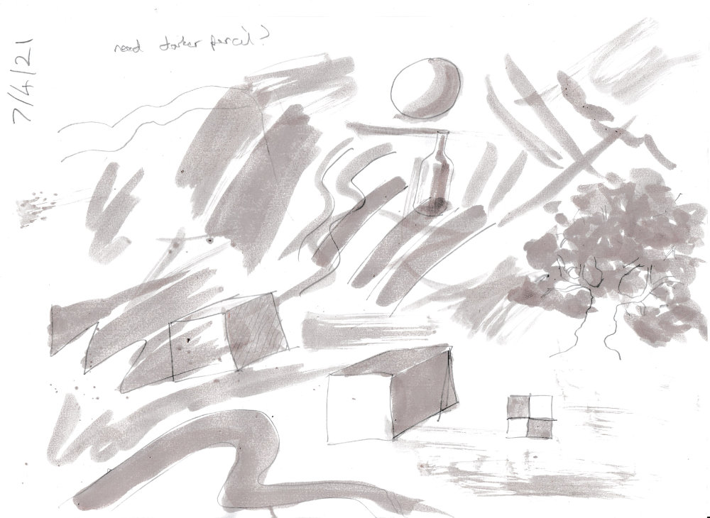
I did this quickly whilst waiting for the children’s riding lesson to finish. I was standing with a small sketchpad, so it was hard to keep the lines straight. I wonder how people do that. Again, the scan has missed some of the lines. I’ll have to use a darker pencil.
A clean, meticulous drawing. It must have taken a long time to do the whole sketch. I’ve only done a small corner. I wonder if he did it all on the spot.
I notice now that I got the angle of the tower wrong. I have to be careful to get the basic shapes right before filling them in.
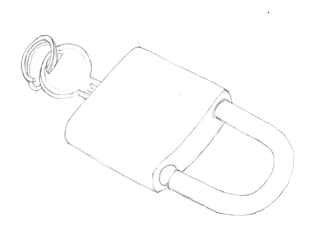
It’s hard to judge the angle of an ellipse, like the top of the key here.
I’m definitely drawn more to the clean line approach. It takes more work, though, because you need to clean up the lines and make sure they are firm and bold.
I didn’t know if the ink would erode the surface of the print paper. It’s okay. I plan to start copying Tiepolo but notice that Tiepolo uses two tones of wash. I’ll try just one at first in my own drawings.
I love the way art deco brings in influences of Greek, Egyptian and Japanese art. The scan didn’t capture the lines very well unfortunately.
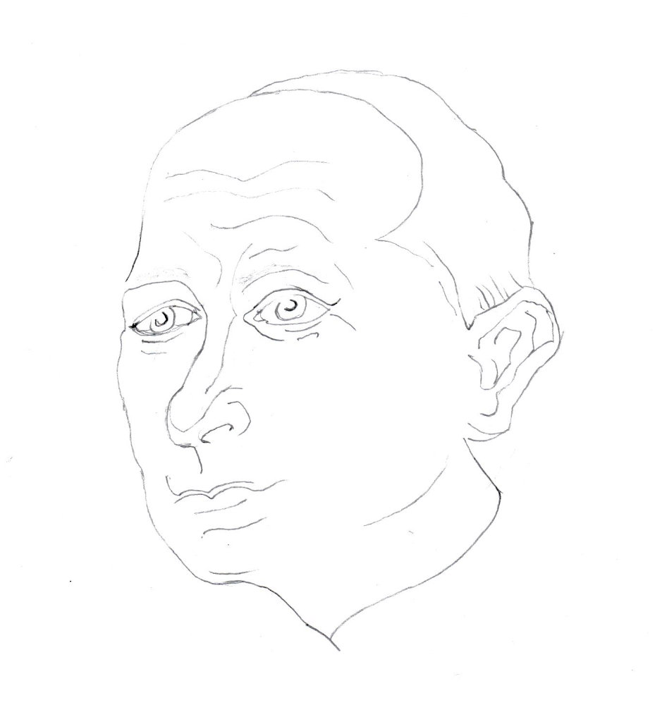
A portrait with the clean line approach, with a subtle use of shading on the eyebrows (which the scan doesn’t show).