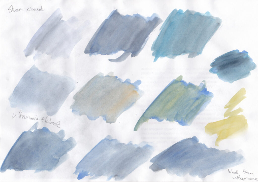
Had a storm today and tried to match the colour of the cloud. Ultramarine with a bit of black seemed to do it. I’m not sure if the paint in my box that looks like black really is black. It could be indigo.
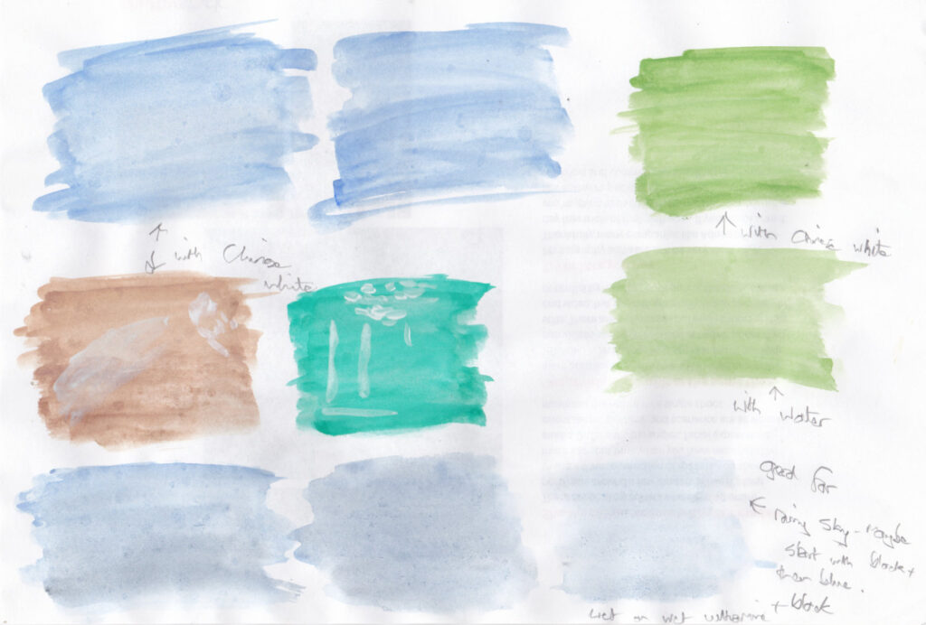
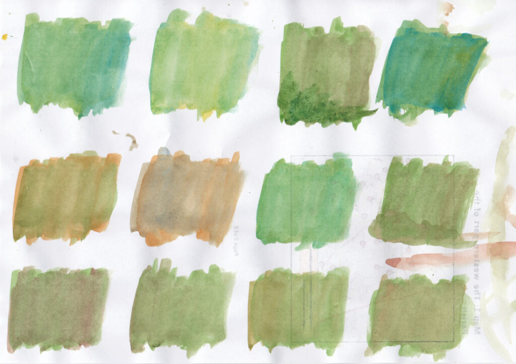
I notice the new versions of my paint set have white instead of black/indigo. I wondered what use whiote would be when you could just let the white of the paper show through a thin wash. So I tried mixing with white in the second set of swatches. Still no idea – small highlights?
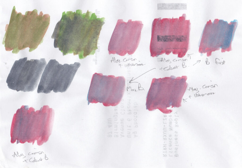
I was pretty happy with the colour I mixed for the flowers (alazarin crimson with a touch of ultramarine). I tried painting this on top of a layer of green paint but of course it was drab. So then there’s the question: how do you paint lots of small flowers first then green afterwards without painting over the flowers or leaving an obvious white space around them? Masking fluid would be too clumsy.
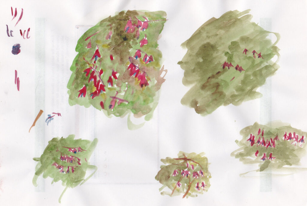
I’ve decided a good way to learn how to mix colours is to choose an object and try and match its colour, using only the paints in my paint box. This time I chose the leaves of a fuschia bush that is just outside my window.
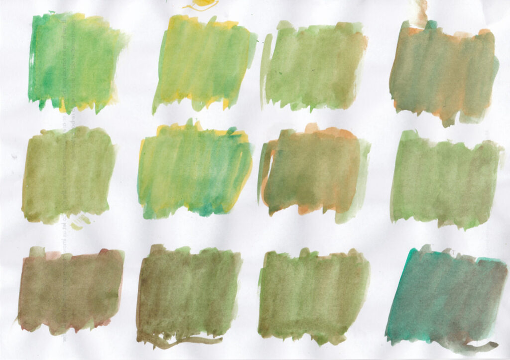
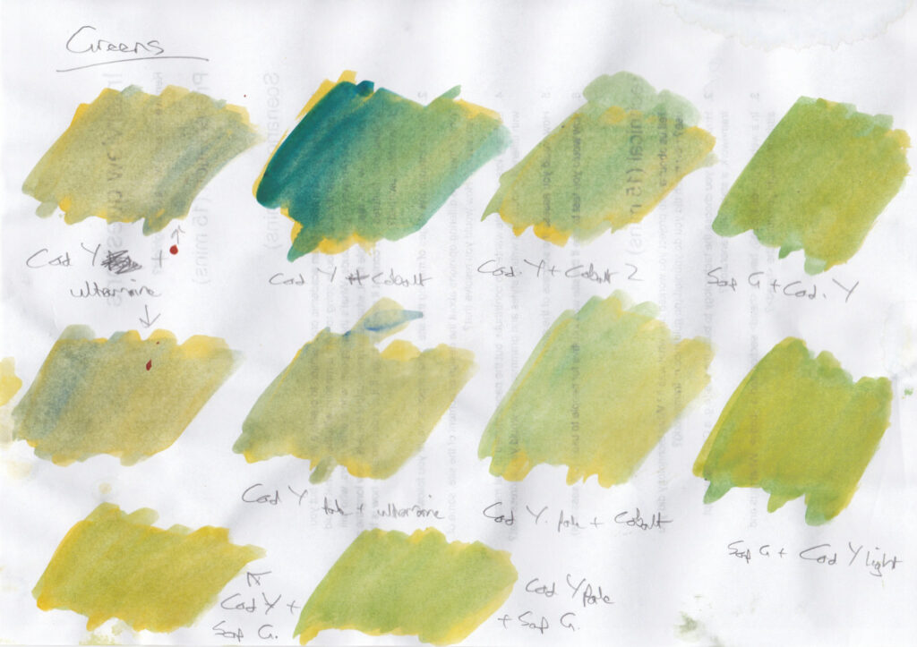
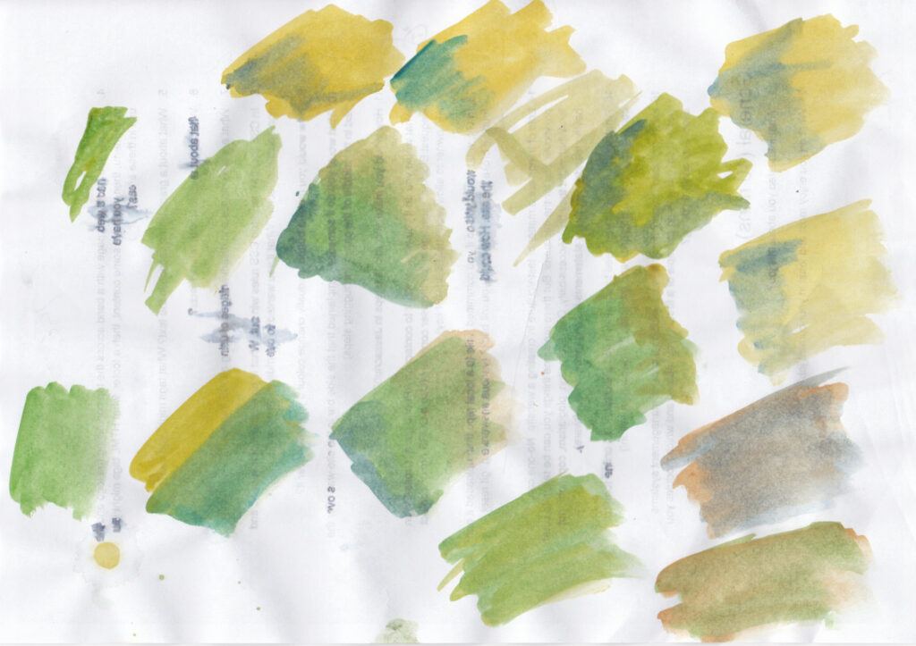
I found the colour very difficult match. I think part of the problem was that water colours are pale, so I couldn’t get a colour dark enough. The best match was given by sap green and a touch of burnt umber. The trick is to start with the closest colour I’ve got in my palette then add a dash of another colour. There are so may greens you can make with just two colours – more than I’d created in my greens study.
All this makes me think two things: (1) water colour is always going to be paler than real life, unless you layer it and lose the luminosity of the paper; (2) water colour is always going to be impressionistic.
The fuschia bush has hundreds of red and purple flowers, plus red and brown branches. How can you ever accurately represent that in watercolour, where you need to move fast? It can only ever be an impression. It is the opposite of photography, which captures all the details but which struggles to give a subjective impression.
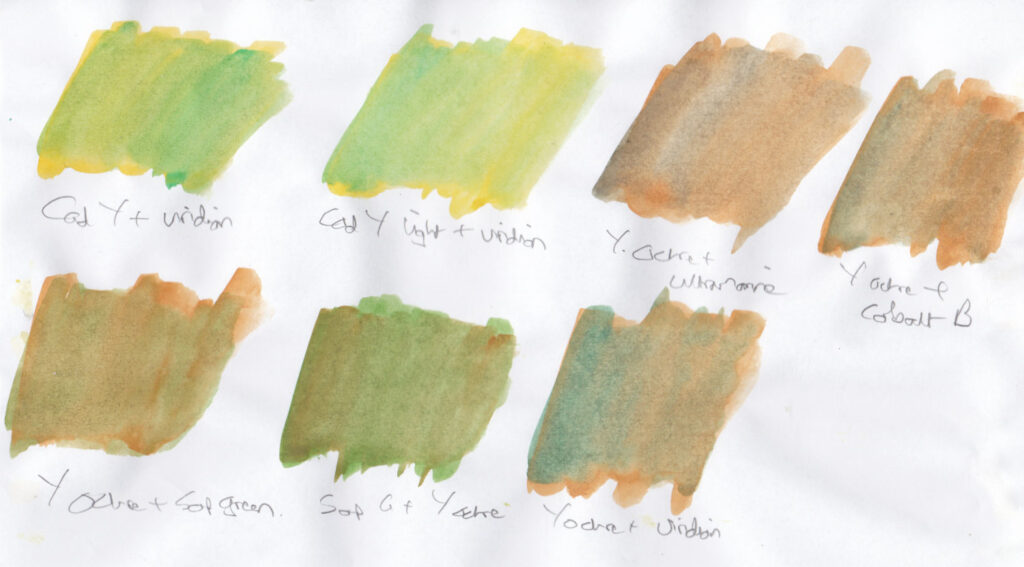
I mixed different greens using only the colours in my paint box, and using only two colours. It’s surprising how many you can make! Mixing with yellow ochre often just ends up with brown.
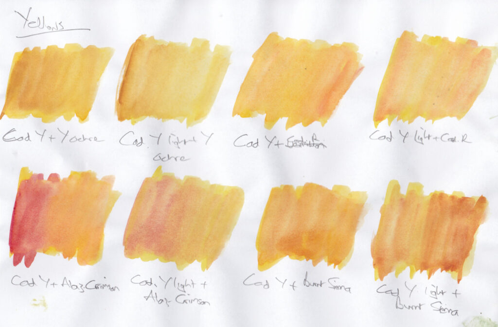
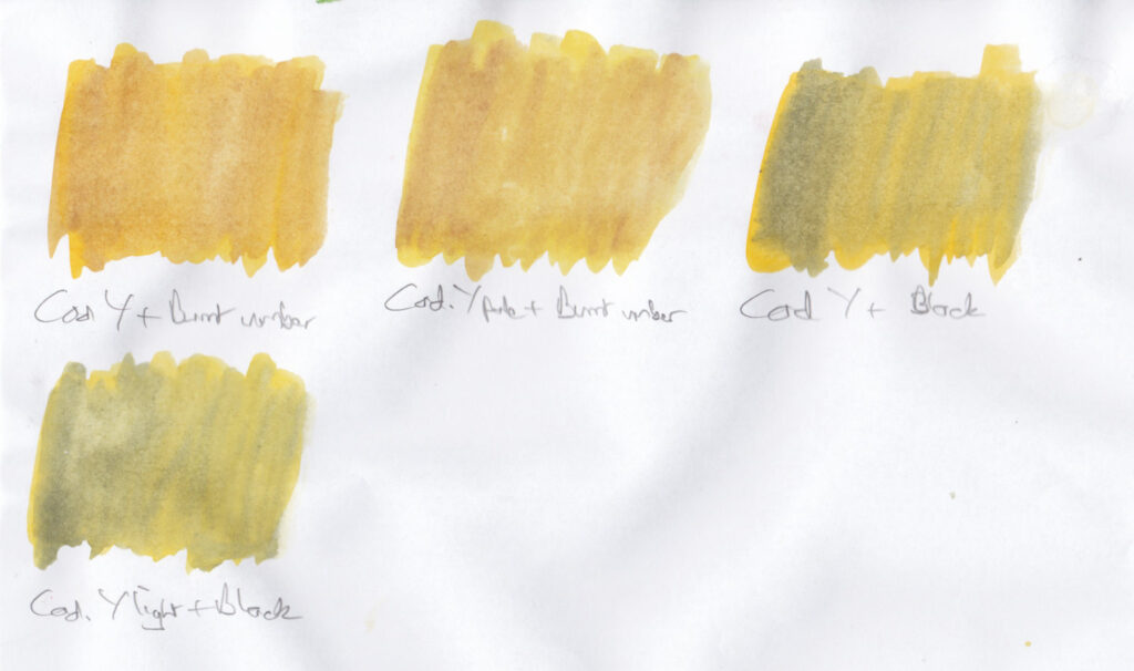
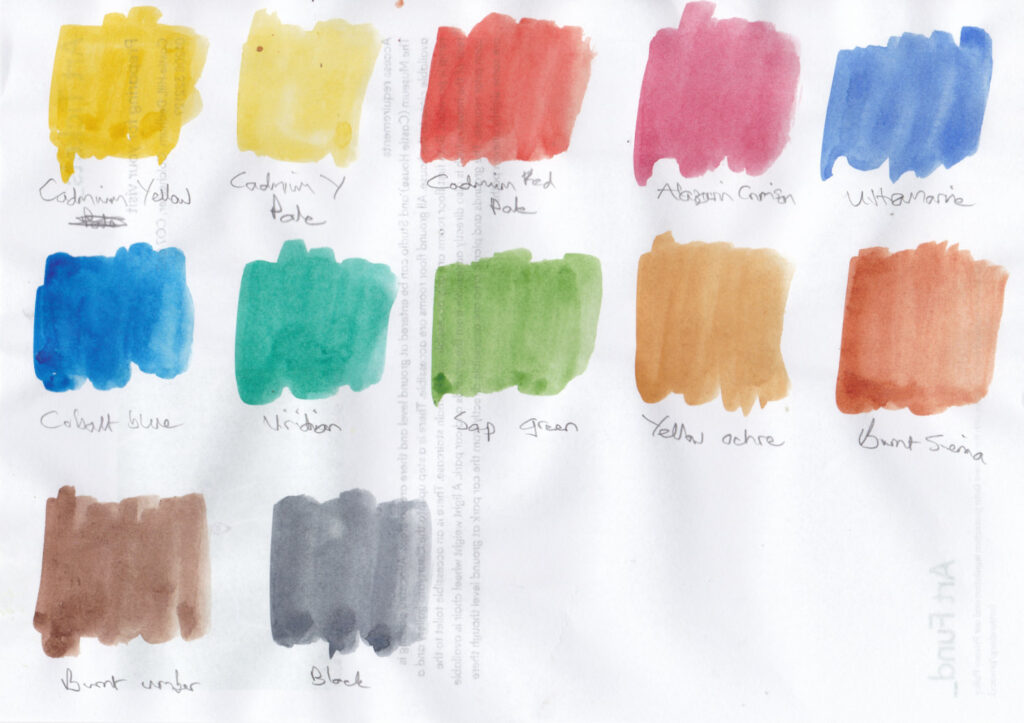
I’ve got a set of 12 Cotman paints in a small paint box. I’m going to systematically learn how to mix colours with these 12 paints. There are only three mixing areas in the paint box and the’re likely to get dirty quickly, so I’m going to mix the colours on paper. I don’t want to mix more than two colours, though, otherwise I will lose the luminosity of the paint. Here are the 12 colours:
Cadmium yellow, Cadmium yellow pale, Cadmium red pale, Alazarin crimson, Ultramarine, Cobalt blue, Viridian, Sap green, Yellow ochre, Burnt sienna, Burnt umber, Black
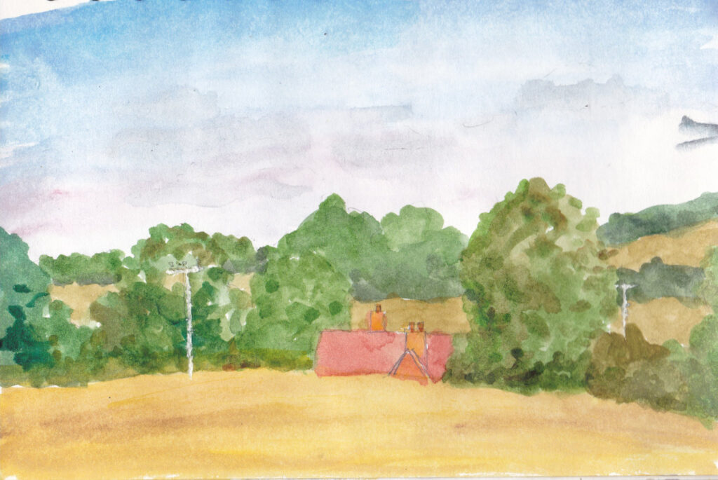
I decided I needed to add some colour to the pictures, since it’s half way through the year. I did this in 20 mins whilst waiting for my daughter’s horse riding lesson to finish. I realised quickly I didn’t know how to get the right colours. I only did an initial wash of the trees and I tried to finish it off at home, but I couldn’t remember the shadows of the trees, and the house was the wrong colour. I also accidentally dipped my brush into cobalt blue instead of ultramarine blues at the start of the sky!