I’ve decided a good way to learn how to mix colours is to choose an object and try and match its colour, using only the paints in my paint box. This time I chose the leaves of a fuschia bush that is just outside my window.
I found the colour very difficult match. I think part of the problem was that water colours are pale, so I couldn’t get a colour dark enough. The best match was given by sap green and a touch of burnt umber. The trick is to start with the closest colour I’ve got in my palette then add a dash of another colour. There are so may greens you can make with just two colours – more than I’d created in my greens study.
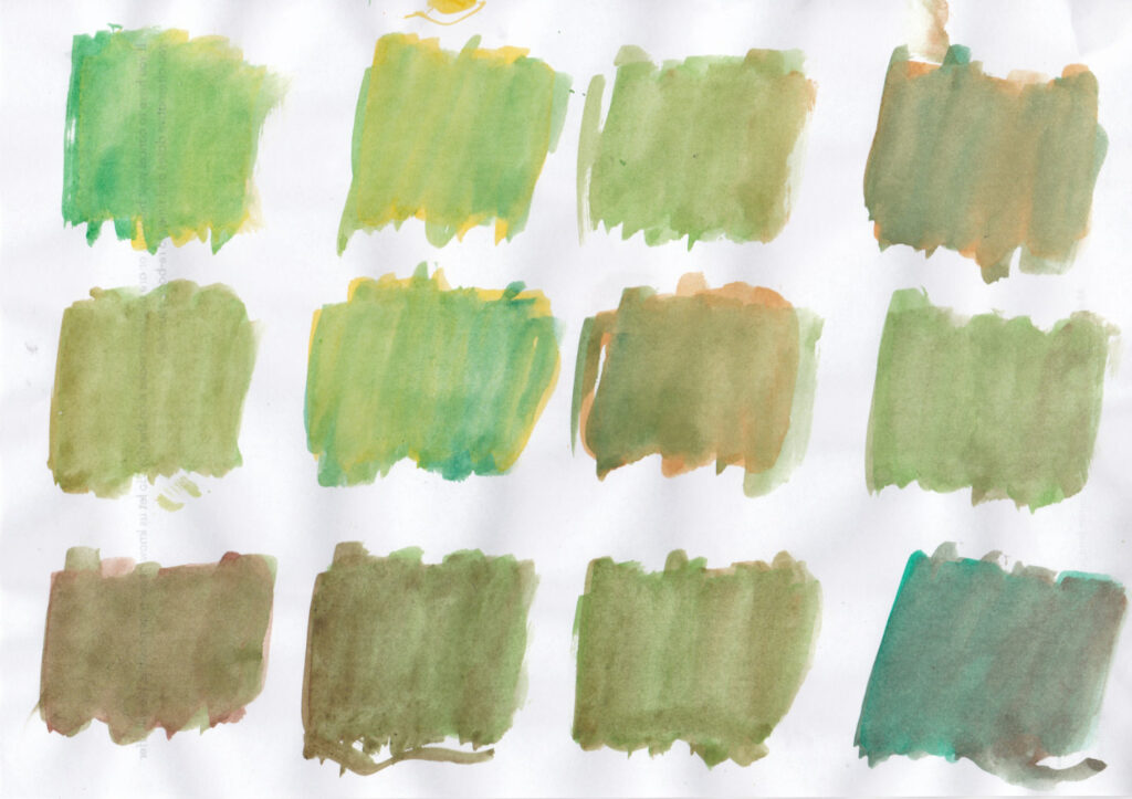
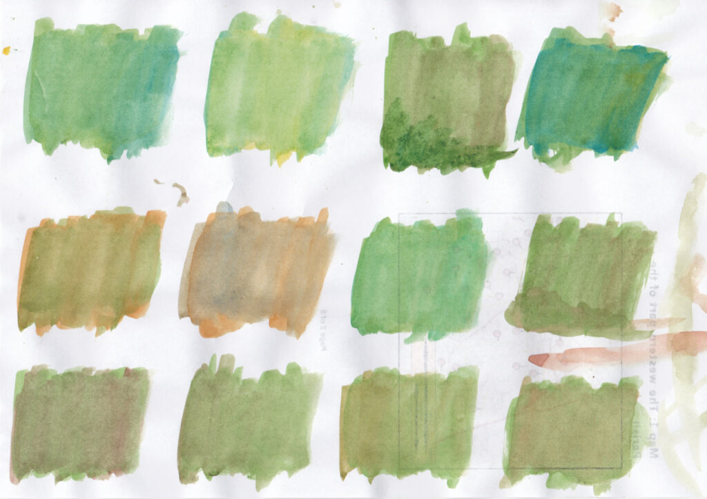
All this makes me think two things: (1) water colour is always going to be paler than real life, unless you layer it and lose the luminosity of the paper; (2) water colour is always going to be impressionistic.
The fuschia bush has hundreds of red and purple flowers, plus red and brown branches. How can you ever accurately represent that in watercolour, where you need to move fast? It can only ever be an impression. It is the opposite of photography, which captures all the details but which struggles to give a subjective impression.