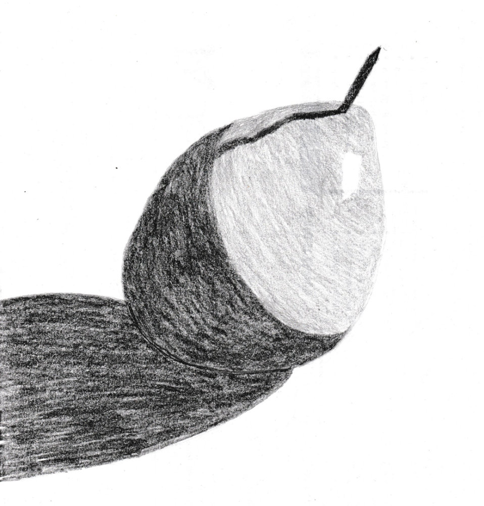
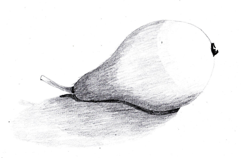
I had two gos because it was difficult to see the edge of the shadow. the pears was dappled with brown, too, which complicated matters.
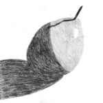
So these drawings look okay from a distance (sse the small version below), despite their simplicity. Really important to get the basic tonal areas right.
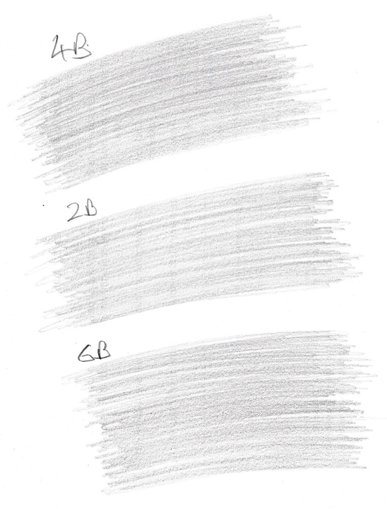
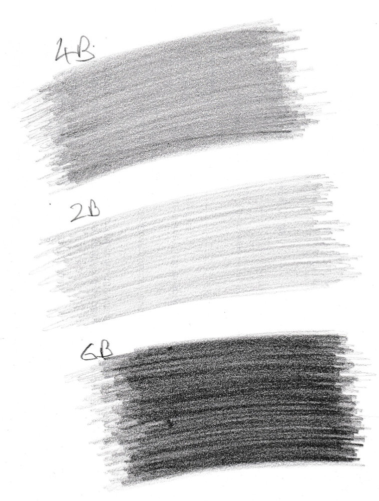
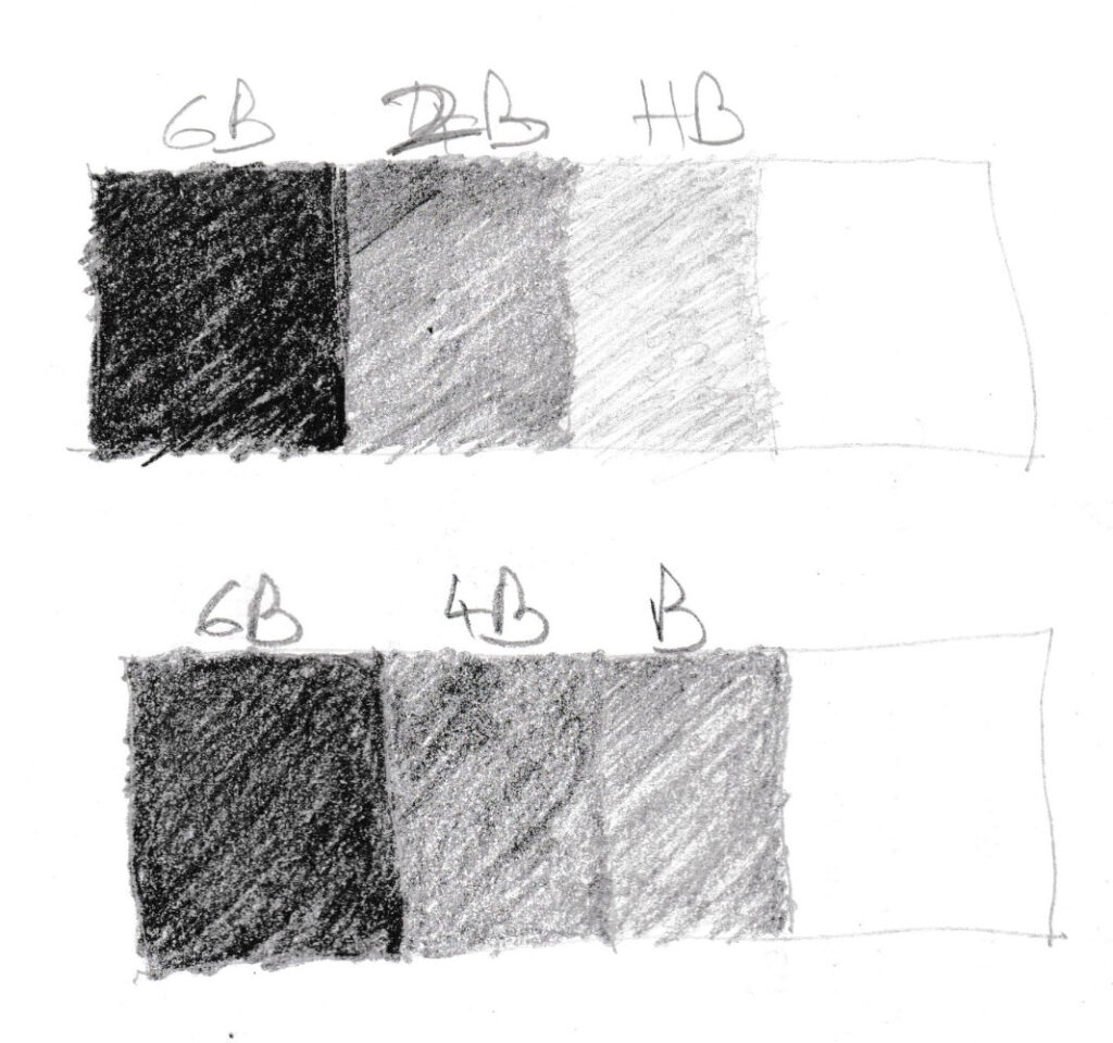
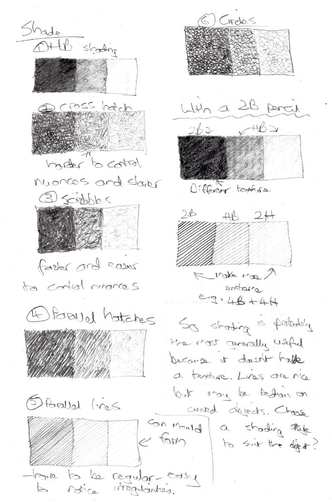
Here are three blocks of shade with the same pressure from different pencils:
You can’t see the difference. In order to make the tone differences obvious you have to press down on the 6B, press a little on the 4B and only press lightly with the 2B:
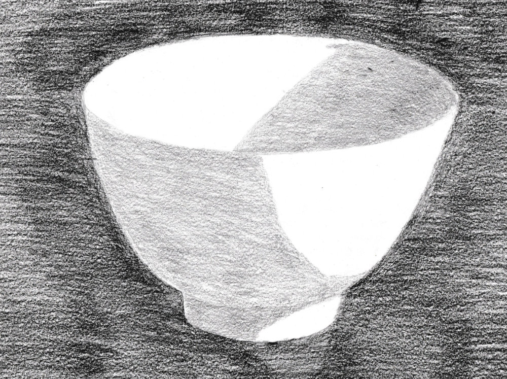
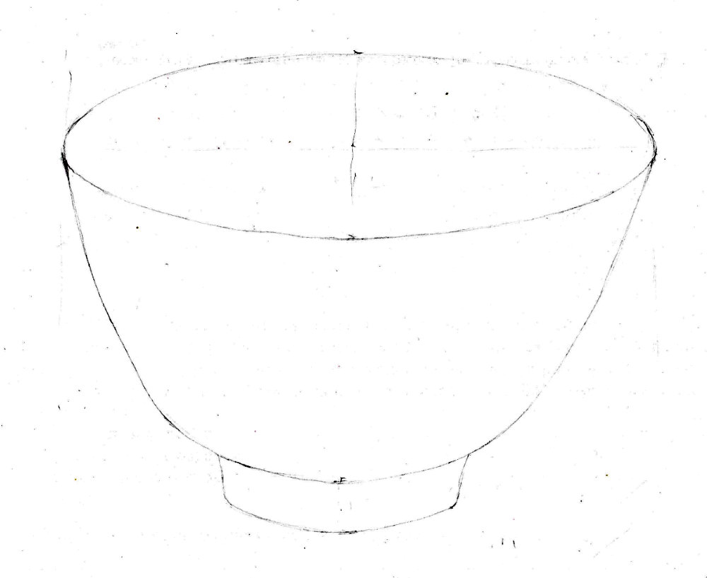
When I first started I measured the height wrong, so the bowl is the wrong shape. It’s so important to do the first measurements accurately.
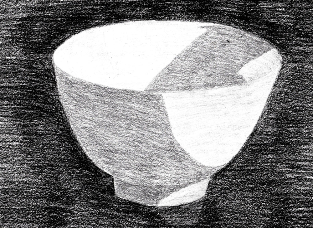
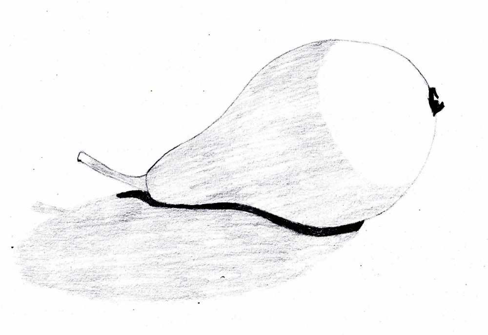
I took a few specular hightlights to be white, and set the tones on the basis of this. This was a mistake. You need to ignore the small areas and set the tone for the larger areas.
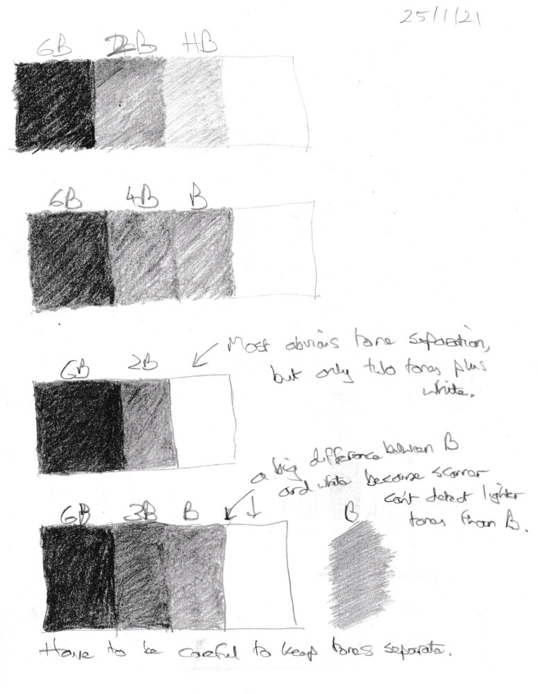
The lighter areas are HB but you can’t see that at all in the scan, so perhaps I should stop using HB. Perhaps I’ll use white, 2B and 6B. But I don’t think this will be enough to make the object real. The above drawing looks like it is three tones (beacuse you can’t see the difference between HB and white), and it looks flat. Three tones don’t allow scope for detail. The trouble with the above was that the background was black, so I couldn’t use 6B on the bowl, just the background. You need to factor in the tone value of the background when planning the drawing. In this situation perhaps I could have used 6B on the bowl, even though there is nowhere on the bowl as dark as the background. Aonther option is to use 2B, 4B and 6B and white. I’ll try that.
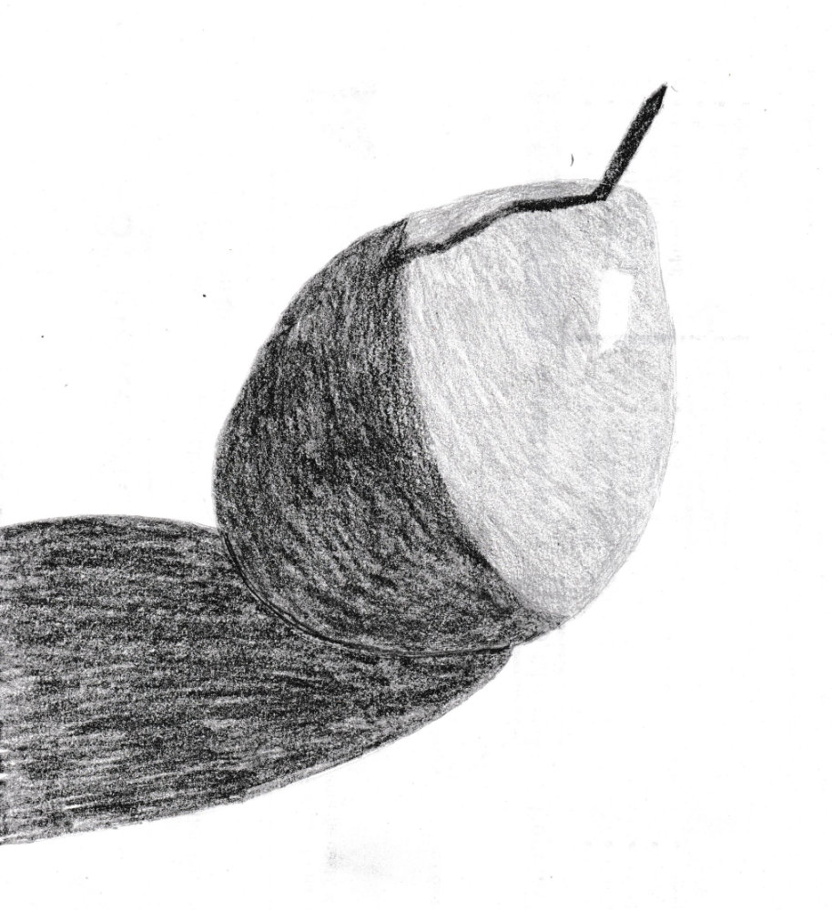
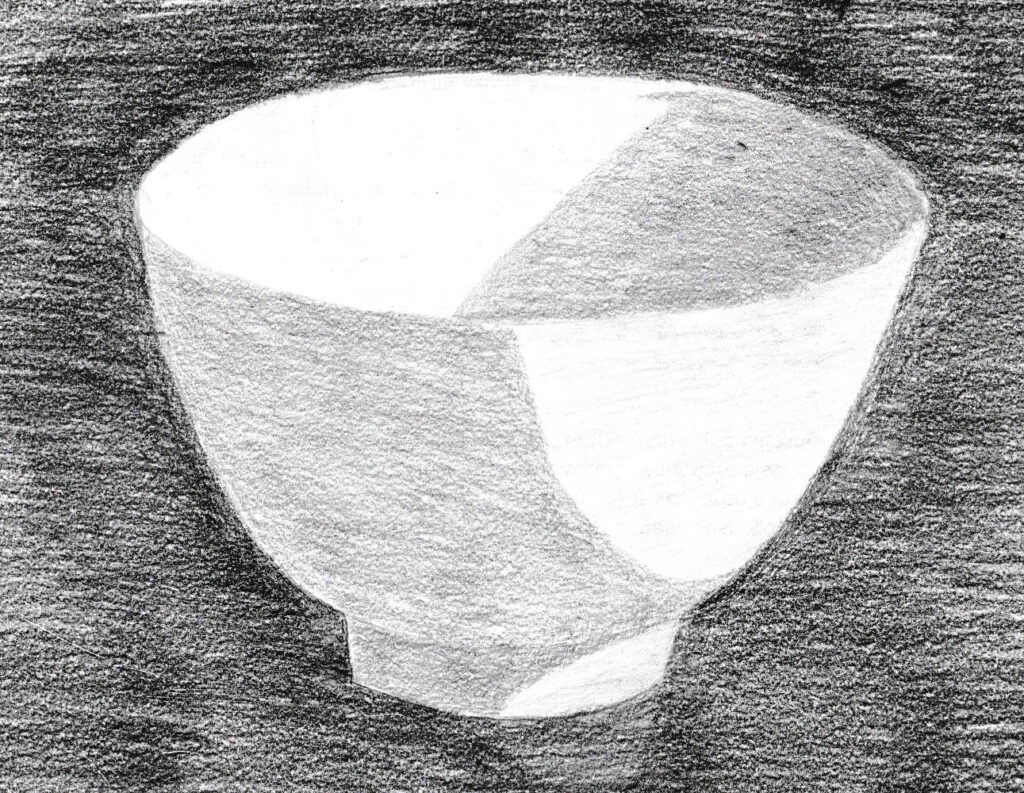
Here is a slightly simplified version, with subtle highlights removed. It works better. Really need to simplify tonal areas.
So 6B, 2B and HB seem to have the best separation. Unfortunately HB doesn’t show up very well in scans. Adding this third tone to the pear:
I guessed the tones because the pear was not in front of me, which of course is bad. Apart from that, there are a few issues:
Even three tones look clumsy and need soft edges.
It’s hard to tell where the mid-tone begins and ends. The other two are simpler.
It’s easy to skew the tonal scale. If you press to hard on the mid-tone them the dark doesn’t look so dark any more, and the picture starts to look flat. And what if you can’t make the dark darker? Also, the light tone can take up too much of the white area, which can make you creep the mid-tone into the light area, then the dark into the mid-tone area, and the whole drawing looks to dark and flat.
So you need to be very clear on the three values, and start with them evn if you will add more, which you will need to to make the drawing more realistic. So the next step is to practice with just these three tones plus white, then add a couple other tones, so we have three mid-tones.
Tried to make lined shading go with the contours at first, but it didn’t work on this object. Generally a little tricky to do as each line must gradually change contour.
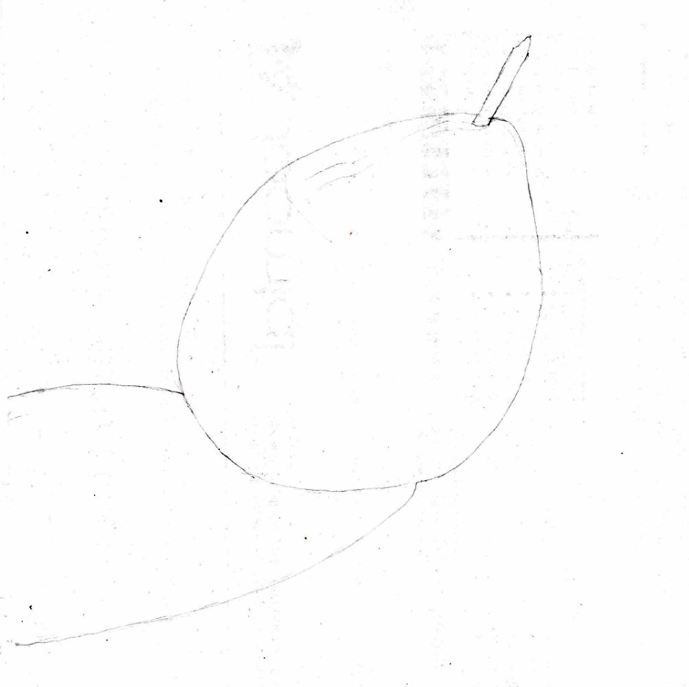
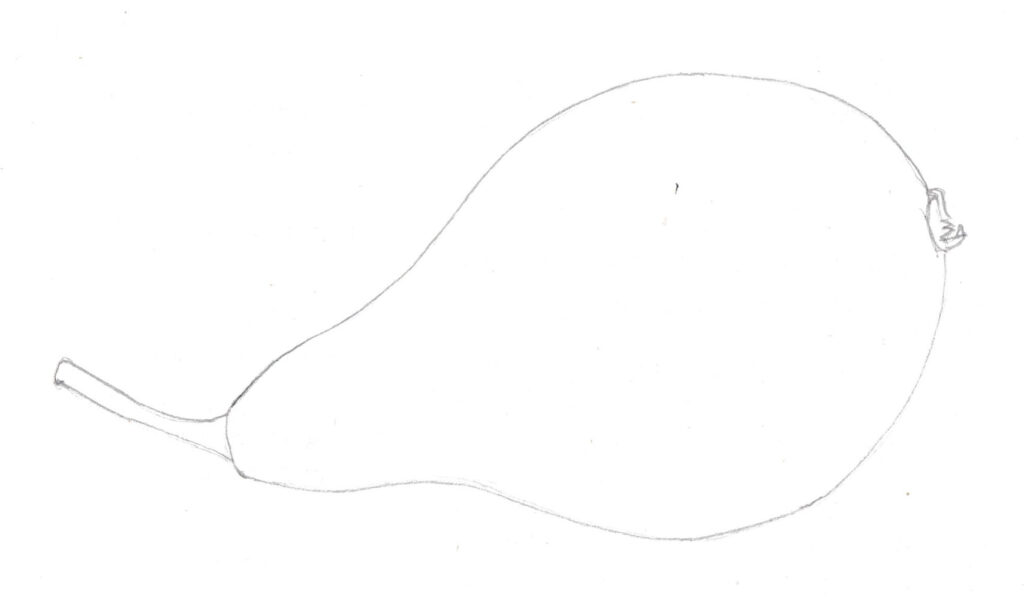
Then a drawing of a pear:
An attempt to shade it using only black and mid-grey:
This wasn’t a success because it’s difficult to give a sense of form with only two shades. Probably works okay with angular forms, but not so much organic forms. Need to introduce an extra shade.
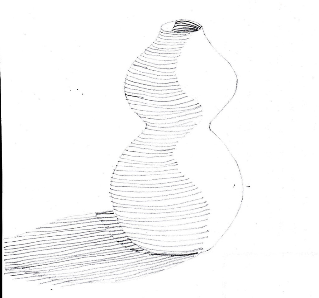
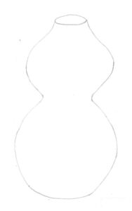
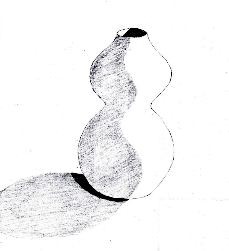
A small wooden vase-shaped object. The shading did not scan well. Perhaps I need to move the shading a key or two darker. I only wanted to use three tones: dark, mid-tone and white.
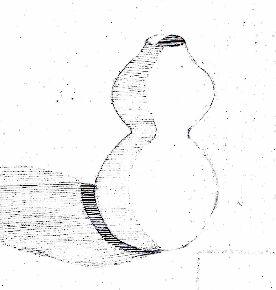
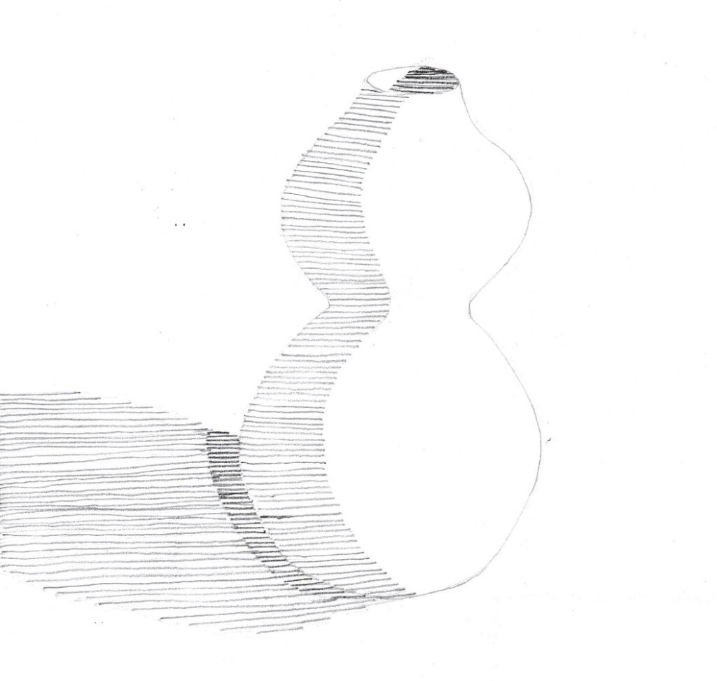
The basic drawing, which I copied for parctisingWith continuous tone shadingWith lines drawn by different pencils: HB for the light lines, 2B for the darker ones. I’ll try using 2B for the lighter ones next time.Went over the previous drawing with 2B and 6B penciles. Stronger now.