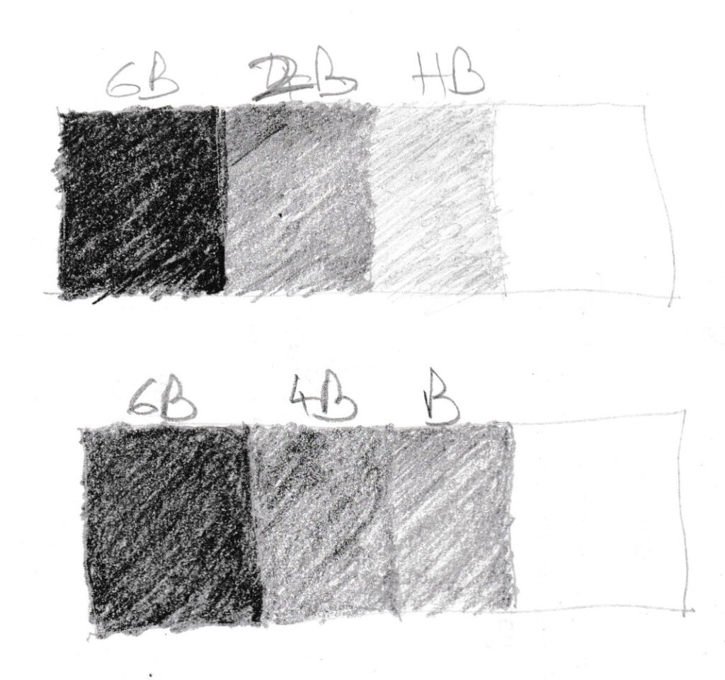
So 6B, 2B and HB seem to have the best separation. Unfortunately HB doesn’t show up very well in scans. Adding this third tone to the pear:
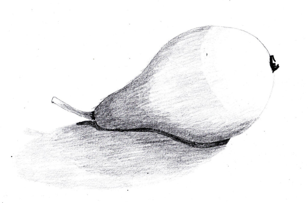
I guessed the tones because the pear was not in front of me, which of course is bad. Apart from that, there are a few issues:
- Even three tones look clumsy and need soft edges.
- It’s hard to tell where the mid-tone begins and ends. The other two are simpler.
- It’s easy to skew the tonal scale. If you press to hard on the mid-tone them the dark doesn’t look so dark any more, and the picture starts to look flat. And what if you can’t make the dark darker? Also, the light tone can take up too much of the white area, which can make you creep the mid-tone into the light area, then the dark into the mid-tone area, and the whole drawing looks to dark and flat.
So you need to be very clear on the three values, and start with them evn if you will add more, which you will need to to make the drawing more realistic. So the next step is to practice with just these three tones plus white, then add a couple other tones, so we have three mid-tones.