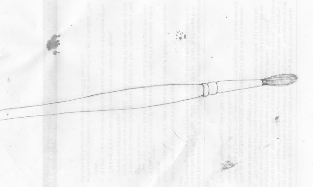
I had this idea od drawing where there is a contrast of packed lines and few lines. The bristles are the packed lines. I notice after uploading it that I haven’t got the circles right again. It’s funny how I don’t notice when I’m drawing it. The metal ferrule doesn’t look tubular.
Circles at different angles
After the drawings of the bell a few days ago I decided I needed to be clearer how to draw circles at different angles. The trick is probably to understand the main axes of the circle: if there was a square around the circle, where would the circle touch the edge of the square? In other words, where are the maximum horizontal and vertical extension points? You can mark off these before drawing the circle.
Wheelbarrow full of weeds
Another one from the allotments. Maybe it lacks contrast, or has too much detail. I added a bit of shading to the weeds in the wheelbarrow but I think that made it worse. Fewer lines might have worked better, with no shading or bold shading so contrasts are clear.
Aqualegia seed pods
My foot
A bell (2)
I found this bell tricky to draw. It’s the old ‘circles in perspective’ problem again.
A bell
I can’t find my old 2B pencil so I’m using another one, which is much more smudgy. Perhaps it’s got more carbon in. It gives a rougher look.
Nettle
I didn’t look at this closely when I started this. I should have looked closely at the leaf serrations, and drawn them like I did in the top right of the drawing. This would have given me a better idea of the shape of the edges so when I drew them they would be more accurate.
Shed on an allotment
I wondered if I could draw the different kinds of plants in front of the shed, whith their different tones and textures.
A boot
Again, one drawn in the holiday lodge, North Yorkshire. I was half way through when Emily walked past and accidentally kicked the boot across the room. I’m not sure if I put it back at the same angle!