I tried to use three tones: dark, mid-tone and the white of the paper. The tonal range isn’t enough, really. Also, there was not enough contrast between mid-tone and white. Going back to earlier experiments it look like 6B, 2B and white would be better. I was just using a 2B for the shading.
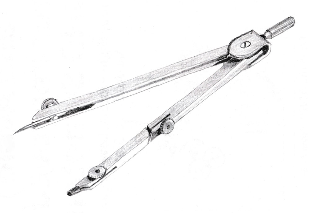
Another issue with line drawing is that the highlight are often on edges, which is exactly where you’ve drawn a line! I’ll have to rub out the line if I’m going to shade the drawing, or make the lines fainter (but then I won’t be able to scan the line drawing).