I tried increasing the contrast by making the darks darker. I also rubbed away some of the lines so that the contrast defined the edges. When you are creting tones you have to look for contrast points and make sure they stand out like they do in the original object. I guess you have to choose whether the drawing is high key (lots of white and pale shadows) or low key (lots of dark and few highlights) or medium (with a broad range of tones).
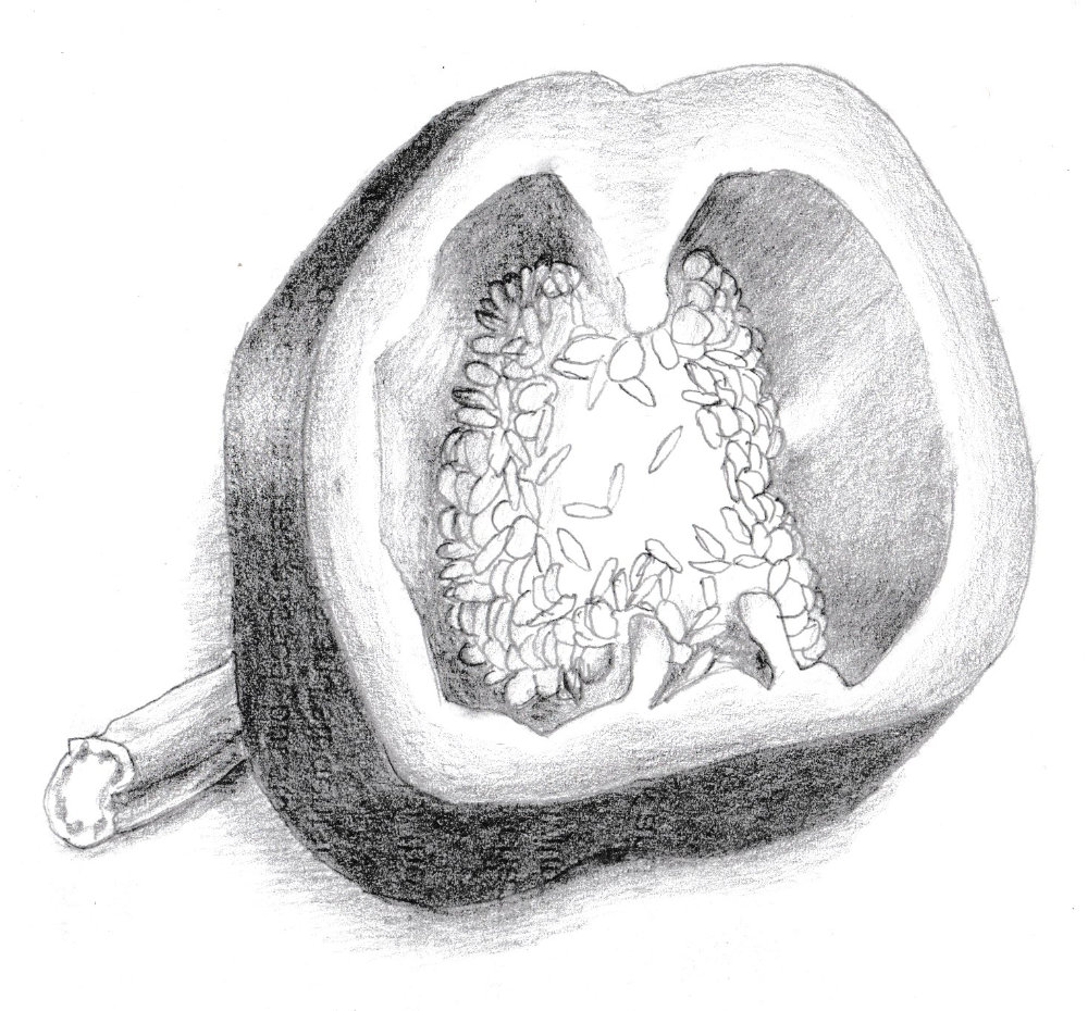
I went too dark with the outside of the pepper. There is too much contrast. It changes the key of the picture. It needs to be lighter or the shadows in the rest of the picture need to be darker. I need to decide on the key beforehand and not drift as I shade. I have to keep relating tones around the object and putting them into tone categoriesso they are all from the same tone palette.