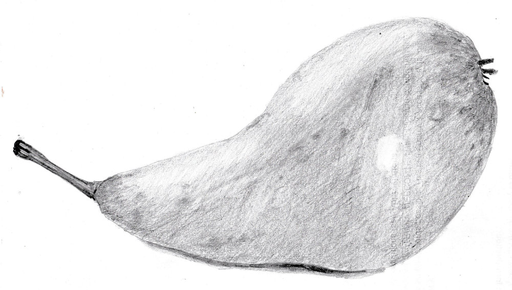
I tried to just stick with a dark tone, a mid-tone and white but it didn’t work. I had to add more tones, and darken the highlights. The tone difference between the highlights and shadows was very subtle. I didn’t understand that at first and the drawing had too much contrast. The highlights still aren’t subtle enough.
I’m doubting the approach of simplifying a picture into a three- or five-tone palette. What if an object has predominantly mid tones, like this one?