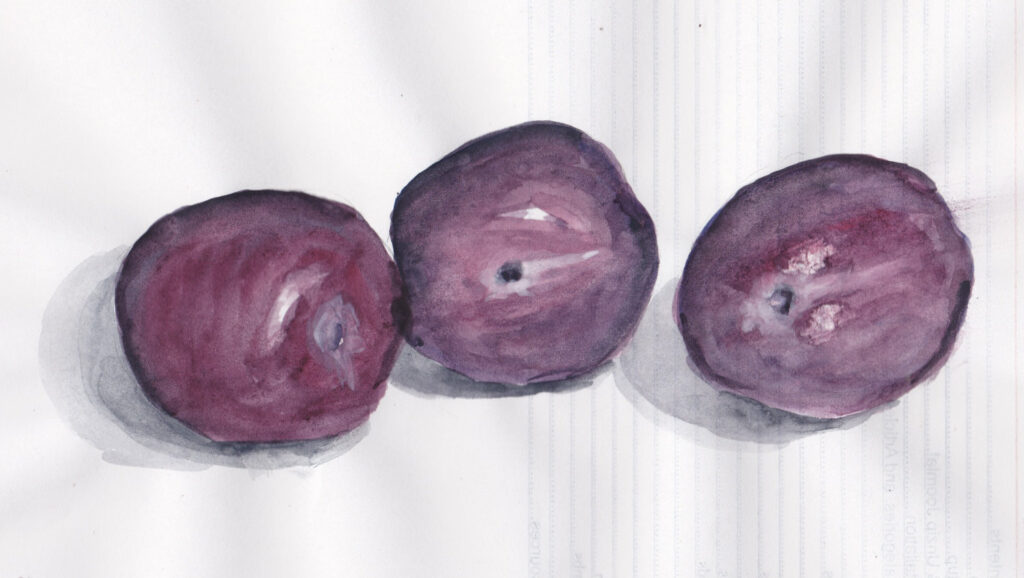
The plum on the right was, first and I forgot to leave white paper for the highlights on it. I scraped the paper away instead, which looks messy. All of the plums are overworked because I mixed the colours on the paper, which is just cheap print paper. The middle one is perhaps the best, though.
Another issue was tone gradation. I couldn’t make the first wash dark so I added the darkest tone at the end, when the first wash was almost dry. That meant the dark tone didn’t bleed in, and look crude. I’m not sure how to get round that.