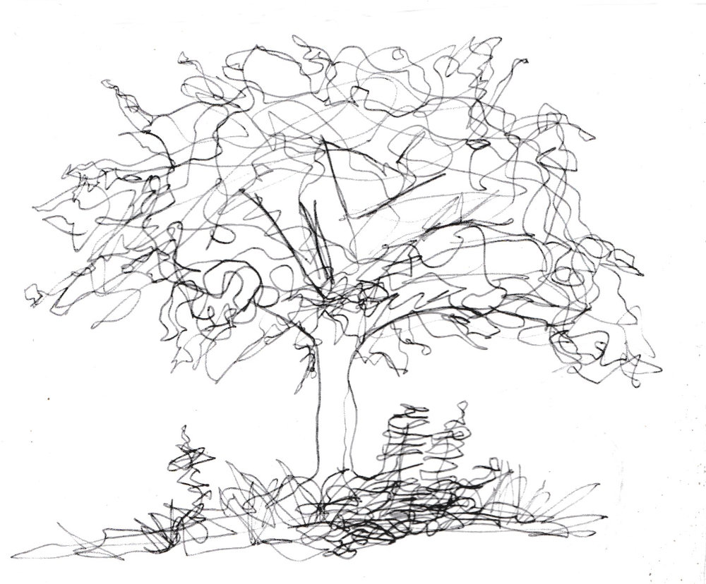
I tried to draw the same thing in pen, but without taking the pen off the paper, just to get a more fluid, less precise feel. It was drawn from memory.
A record of my 'picture a day' challenge
I tried to draw the same thing in pen, but without taking the pen off the paper, just to get a more fluid, less precise feel. It was drawn from memory.
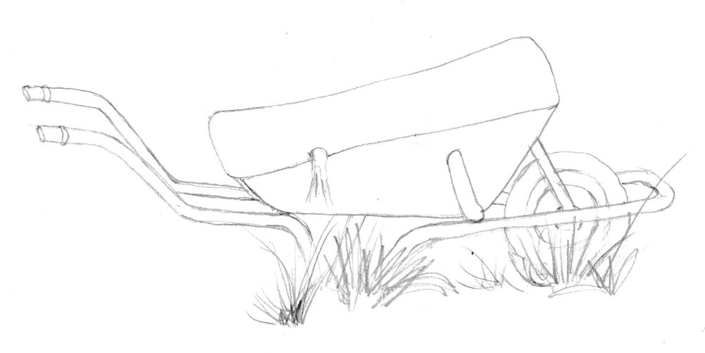
Again, standing with a small sketchbook. I tried to keep the pencil moving and not take it off the paper, to create a freer feel.
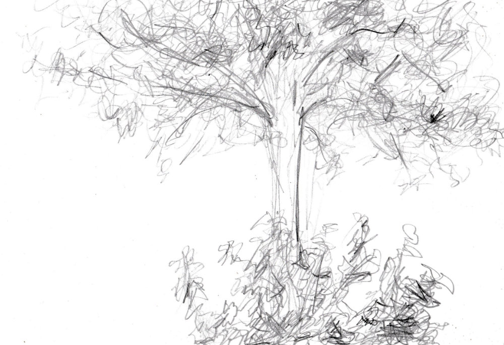
A sketch while standing with a small sketchbook. Again, a very graphic style. I like it but probably should experiment with a faster, freer style.
I tried increasing the contrast by making the darks darker. I also rubbed away some of the lines so that the contrast defined the edges. When you are creting tones you have to look for contrast points and make sure they stand out like they do in the original object. I guess you have to choose whether the drawing is high key (lots of white and pale shadows) or low key (lots of dark and few highlights) or medium (with a broad range of tones).
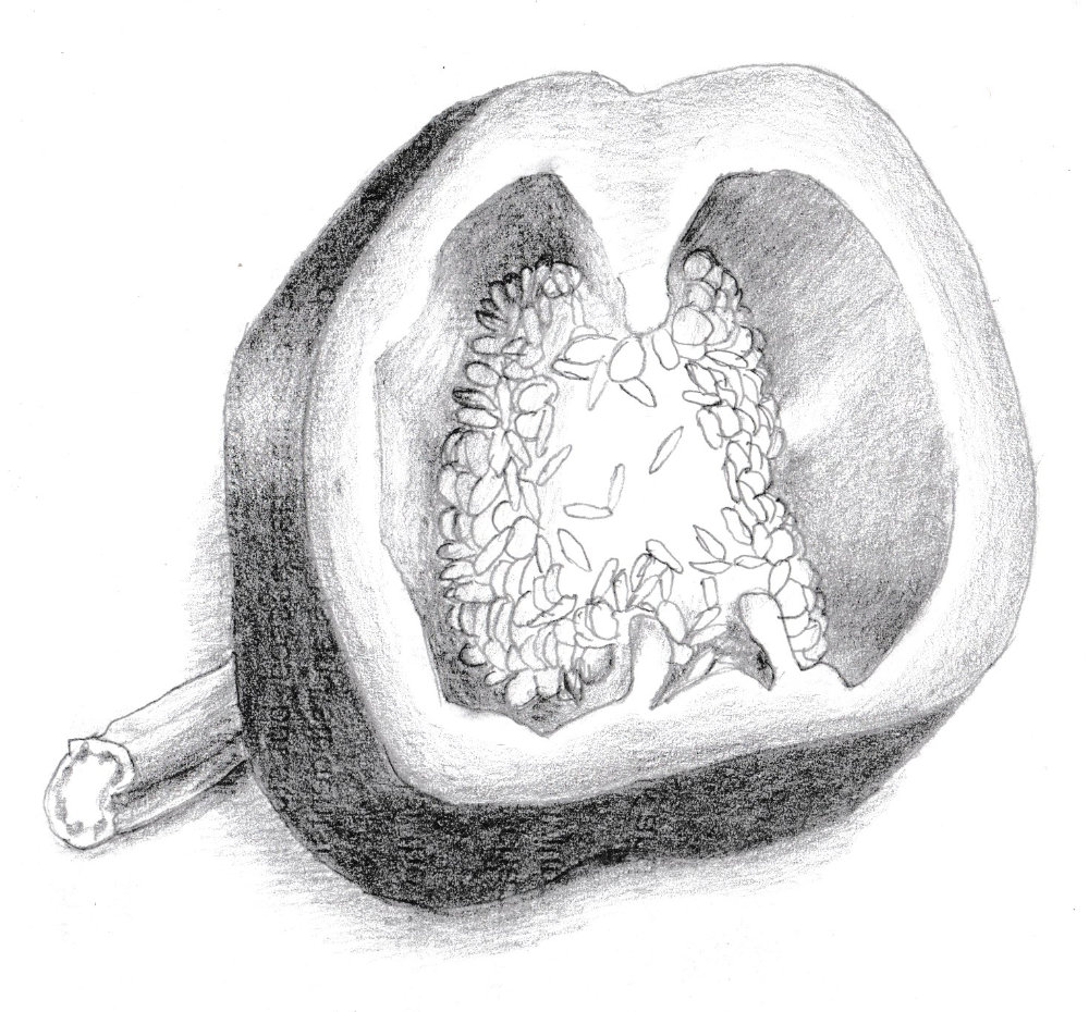
I went too dark with the outside of the pepper. There is too much contrast. It changes the key of the picture. It needs to be lighter or the shadows in the rest of the picture need to be darker. I need to decide on the key beforehand and not drift as I shade. I have to keep relating tones around the object and putting them into tone categoriesso they are all from the same tone palette.
A struggle, this one. I tried to only use a dark tone, a mid tone and white. It didn’t work, though. There were only subtle changes in tone in the pepper. Perhaps I should have exaggerated them more. And then of course there are the bold lines left over from the original drawing. I should have rubbed those out abit so that the tone established itself better.
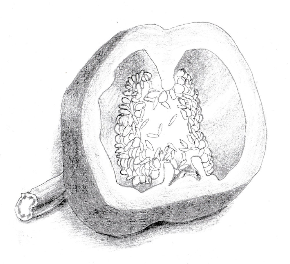
The scan really doesn’t do a good job of capturing the tones. Maybe this is a good thing. It will force me to be simpler and bolder.
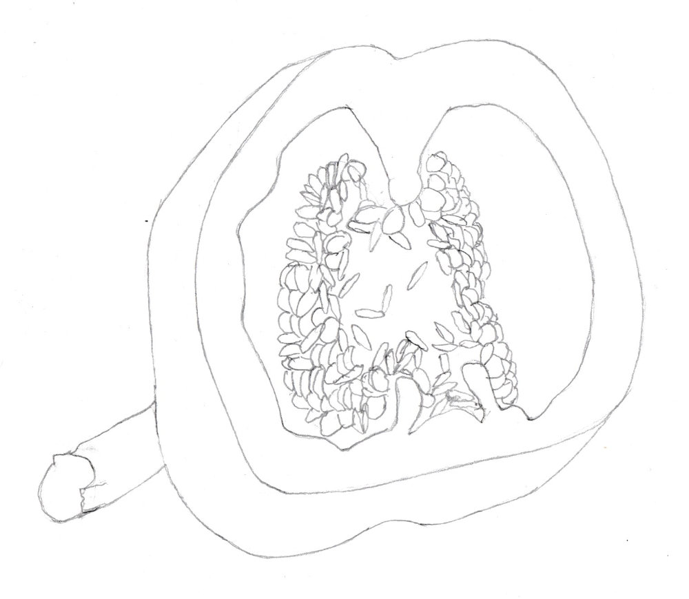
Another very graphic drawing. I’m drawn to these clean lines, but have to introduce tone now.
Segui just draws many lines over other lines and doesn’t worry about the foreground objects blocking out the background ones. It’s a very free style. The characters are like George Grosz characters.

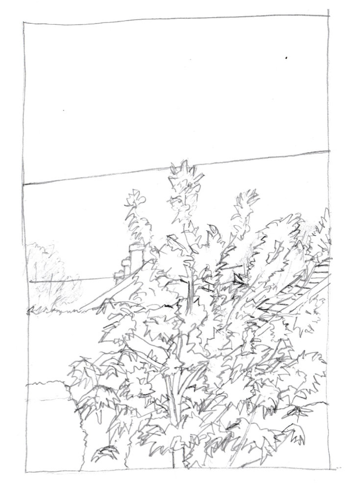
A pretty boring view, with nothing with a cherry tree and a couple of telegraph wires. Be sure you amrk the edge of the tree clearly in this style. It’s off-putting not knowing what’s the tree and what’s the background. I started off drawing the foliage faintly but should have just launched in with bold lines.
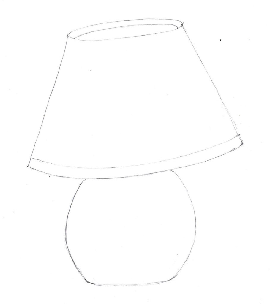
Hurriedly done when tired. Like most of these pictures. Not quite symmetrical. Should have turned it upside down to check.